Video Postcards
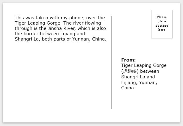
From:
Tiger Leaping Gorge (虎跳峡) between Shangri‑La and Lijiang, Yunnan, China.
In this post, I'll document my progress in making digital postcards using only HTML and CSS, no Javascript, like the one above. Hover over to flip it!
I was inspired by my girlfriend to do so, and she picked up HTML just to make her own. Check out her postcards!.
Postcard Front
First, specifications for the postcard, which will be a video. Commonly, postcards are in 4R size, which is 4 by 6 inches. On the web, we'll just call it a 6:4 aspect ratio. Since most videos and photos are in 4:3 or 16:9, we will need to do a bit of cropping.
You might use these CSS properties to get that resolution without having to edit your videos:
aspect-ratio: 6/4;
object-fit: cover;
Like the other videos on my blog, I use the webm format for its efficient file size.
Your video should be looping, muted, autoplay, and have the controls hidden.
<video loop muted autoplay class="postcard-front">That's all you need to do for the video. You can always do some processing of your own. Colour grading, cropping, and stabilizing the footage are some examples.
If you want more detail, it is important that you right-click this page and inspect element, and look at how the HTML and CSS are structured.
Flipping the Postcard
As we know, the image on a postcard is only half the content. HTML isn't anything like a paper postcard, but we can simulate a postcard with CSS.
The trick will be to have both the front and back elements, but only show one at a time.
You might do it differently, but my layout has three basic components: a front, the video, the back (which I'll talk about in detail later, but for now I'll abstract it into a div), and a div to wrap around the entire thing.
<div class="postcard-wrapper">
	<video class="postcard-front"></video>
	<div class="postcard-back">
		... to be discussed
	</div>
</div>
Stacking the Elements
Without any additional styling, the front and back elements will be stacked on top of each other. You want them to overlap each other. Try to imagine the two sides of a postcard as two pieces of paper stacked on top of one another. A magician does this trick with two cards to make it seem like they changed one.
Most will use the position: absolute/relative style to achieve this, but this messes with
the sizing of the element. We will instead use display: grid, which treats the element as a grid.
To get them to stack, we simply force each direct child of the wrapper to start on row 1 and column 1.
.postcard-wrapper {
	display: grid;

	/* optional styling */
	background: #fff;
	border: 10px solid white;
	box-shadow: 0px 2px 5px #aaa;
	width: 100%;
	margin: 10px 0px 15px 0px;
}

.postcard-wrapper > * {
	grid-column-start: 1;
	grid-row-start: 1;
	... more later
}
Transition Animation
First, we want to flip the entire postcard. I feel like it's best to just do it on hover. If you're extra keen, you can try using a checkbox element to simulate a toggle, again not using Javascript.
.postcard-wrapper:hover {
	transform:rotateY(180deg);
	transition:transform 1500ms;
	transform-style: preserve-3d;
}
Feel free to tweak any of these properties to see what it changes. It's important to
use preserve-3d, although if you asked me to explain 3D transformations I'd be stumped.
The next part is to style the direct children of the postcard wrapper.
The first three lines are for cropping and sizing, and backface-visibility tells
the browser not to render the back of the element if it's been flipped.
.postcard-wrapper > * {
	width: 100%;
	aspect-ratio: 6/4;
	object-fit: cover;
	backface-visibility: hidden;
	grid-column-start: 1;
	grid-row-start: 1;
}
Lastly, the back face should begin already rotated. The rotations apply additively, so a 180° + 180° rotation results in a 360° rotation, back to 0°.
.postcard-back {
	transform: rotateY(180deg);
	... more later
}
We're now ready to fill in the div for the back of the postcard.
Tricky Bits
I noticed that the box-shadow actually gets flipped if you use this sort of transition. There might be a workaround around it, but I decided to just not give it any x-offset, so it looks the same even when mirrored, because it's symmetrical about the centre.
Without box-shadow, it loses its depth, so this subtle change helps keep that 3D effect without additional trouble.
Postcard Back
You can honestly just use an image for the back of the postcard, but I wanted it to be as scalable
and reusable as possible, so mine contains p elements for the correspondence text.
First, for the background, I got an SVG for the back from Wikimedia commons. (Thanks, Wikimedia user Mightyquinn84!)
You can copy-and-paste the SVG into HTML, or save it as a file and link it in an img tag.
I highly suggest the latter, for ease of reading and editing.
Writing on the back
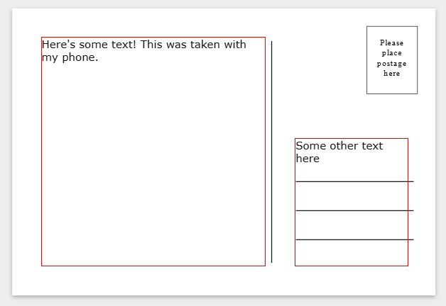
You can have as much as you want on the back of the postcard, but I will have two text boxes. The HTML looks like this. Feel free to experiment with what works for you.
<div class="postcard-back">
	<img src="/files/postcard-back.svg">
	<p class="postcard-message">
		This was taken with my phone...
	</p>
	<p class="postcard-address">
		<b>From:</b> ...
	</p>
</div>
We want the text to overlap over the image, so we're using the grid system again,
this time within the postcard-back div. As usual, the children all start on row 1, column 1.
.postcard-back {
	transform: rotateY(180deg);
	display: grid;
}

.postcard-back > * {
	grid-column-start: 1;
	grid-row-start: 1;
}
Arranging the Text Boxes
Next, the text boxes should be positioned in their respective areas. I tried using the grid system
and putting postcard-address in column 2, but it didn't work well.
This ended up working for me:
.postcard-back > p.postcard-message {
	margin: 5% 0 5% 5%;
	width: 55%;
}

.postcard-back > p.postcard-address {
	margin: 30% 0 5% 67.5%;
	width: 27.5%;
}
We want to use margin instead of padding, because padding alters the size of the element. I'm using percentages for margins, with rough increments until I get the arrangement I want.

Always remember, border: 1px solid red is your debugging best friend.
Again, it might differ based on what you want! Feel free to experiment! In the end, I edited the SVG to remove the address lines and to lighten the other lines.
The end product
Well, that's it! For making it to the end of this post, here's another postcard, from my recent trip to Yunnan as well.
You can basically just copy-paste your HTML and change the video source to keep making these. And since we've set it up so nicely, if you make any edits to the main SVG, the changes will reflect throughout as well.
From:
View of Haba Snow Mountain (哈巴雪山) from Shangri‑La, Yunnan, China.
Thanks for reading!